What Color of Blinds Goes with Everything?
What Color of Blinds Goes with Everything?
If you want blinds that will never clash with your furniture, wall paint, or flooring, go with white, beige, or light gray. These neutral shades are classic, understated, and universally compatible.
Choosing blinds can be overwhelming with so many colors and finishes available. But from a window treatment expert’s perspective at Love Is Blinds GA, the answer is clear: neutral-colored blinds are your safest bet.
They’re:
- Versatile enough to match any design trend
- A clean backdrop for both bold and minimal interiors
- Timeless, so you won’t have to update with every style shift
Let’s break it all down room by room, surface by surface, and shade by shade.
Why Neutral Blind Colors Work Everywhere
Neutral blinds don’t just “match” — they enhance. Their flexibility lies in how they complement various palettes and environments.
Best Neutral Color Blinds
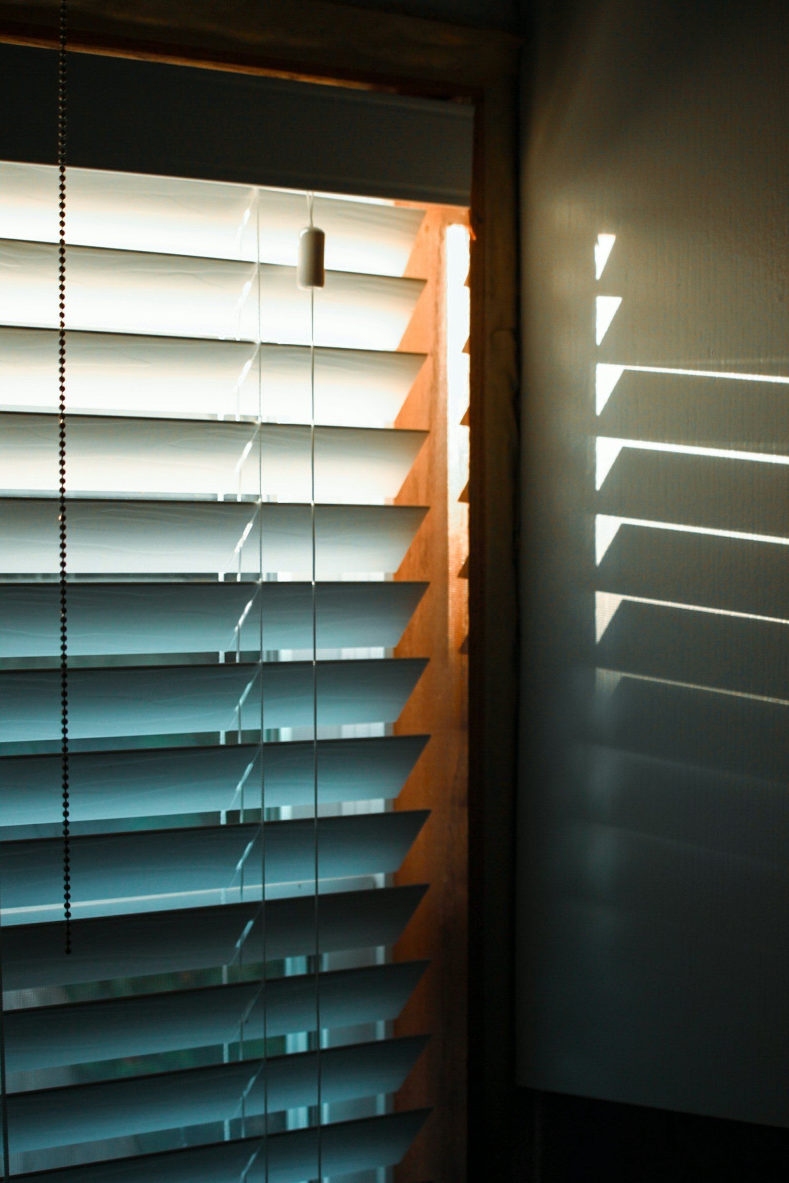
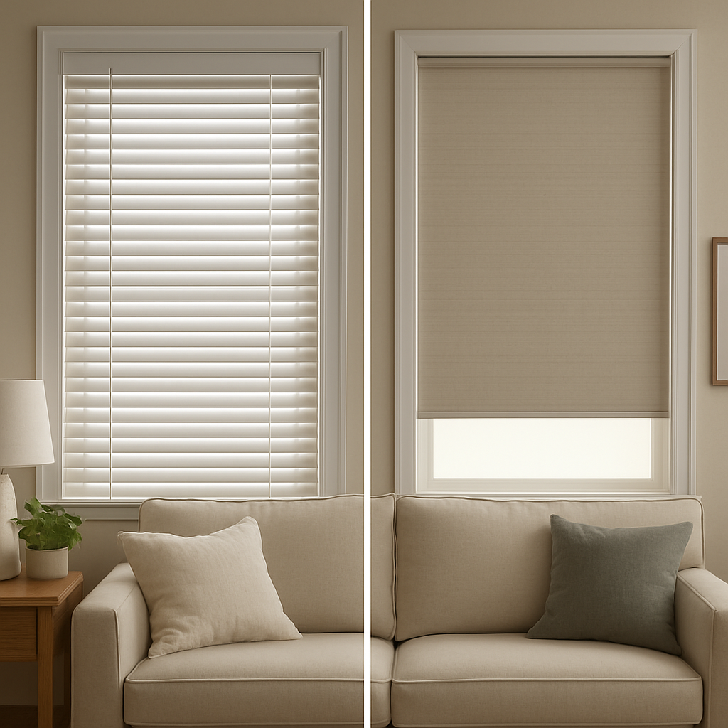
- White – Crisp, clean, and bright
- Off-white / Ivory – Warmer feel, great with natural wood or warm walls
- Light gray / Dove gray – Cool and modern, fits industrial, minimalist, or traditional settings
- Beige / Greige / Taupe – Soft earthiness, bridges warm and cool palettes
Color Psychology of Neutrals
- Calm and
Comforting – Creates a peaceful backdrop
- Non-distracting – Lets other design elements shine
- Timeless – Doesn’t go out of style like bold colors can
Interior Design Principles
- Balance – Neutral blinds bring harmony when your furniture or wall color is bold
- Cohesion – They tie various room elements together seamlessly
- Contrast – Light blinds can pop against dark walls, adding depth
Neutrals are like denim — they work with everything.
Best Blind Colors by Room Type
Different rooms have different functions, lighting, and style needs. Here’s how to choose the best “go-with-everything” blinds for each:
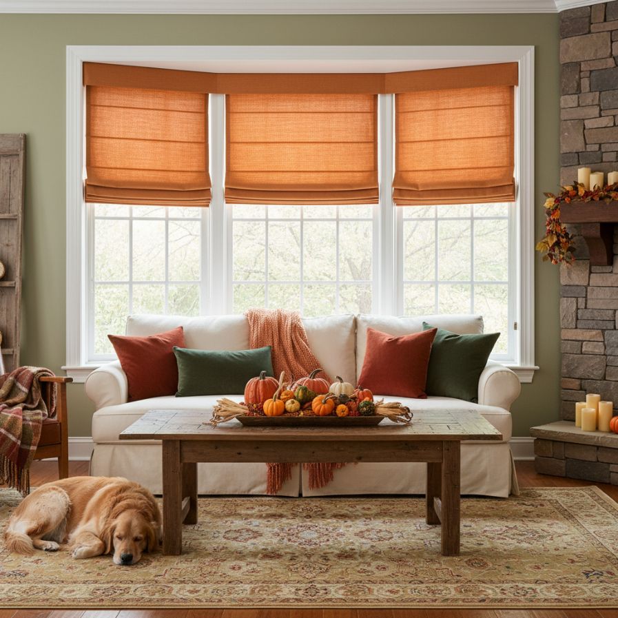
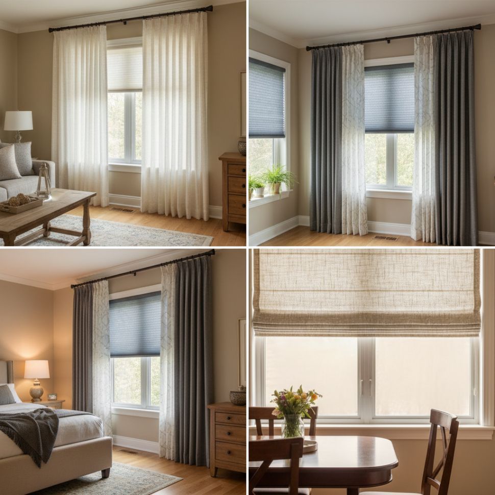
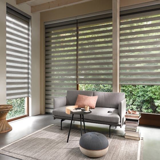
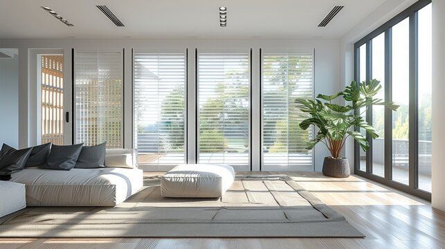
Living Room
Best Colors: Soft white, dove gray, warm beige
Why It Works:
- Matches both modern and traditional furniture
- Adapts to changing lighting throughout the day
- Feels open and inviting
Design Tip:
Faux wood or textured fabric in neutral tones adds warmth without taking over the room.
Bedroom
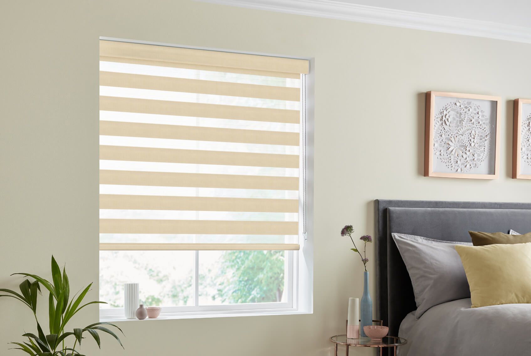
Best Colors: Cream, pale gray, blackout options in taupe
Why It Works:
- Promotes a calm, restful environment
- Blocks light while blending in
- Doesn’t distract from decor or bedding choices
Pro Tip: Choose blackout
cellular shades in neutral colors for privacy and sleep quality.
Kitchen
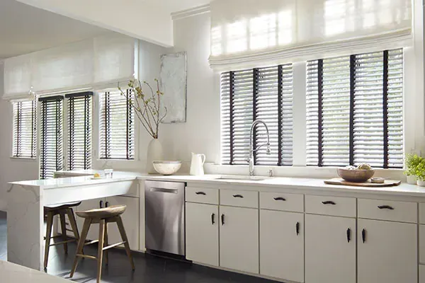
Best Colors: White, light taupe, easy-clean neutrals
Why It Works:
- Matches cabinets, backsplash, and countertops
- Handles moisture and heat well
- Brightens up small kitchens
Material Choices: Aluminum or faux wood blinds in white are functional and clean-looking.
Bathroom
Best Colors: White faux wood, vinyl beige
Why It Works:
- Moisture-resistant and durable
- Looks crisp and hygienic
- Doesn’t fight with tile or fixtures
Ideal Products: PVC or composite blinds with neutral finishes.
Office / Study
Best Colors: Muted gray, taupe, off-white
Why It Works:
- Supports focus without glare
- Subtle backdrop for digital or paper-heavy environments
- Easy to style around shelving, desks, and décor
Design Insight: Matte finishes reduce distraction and glare.
Matching Blinds to Home Features
This is paragraph text. Click it or hit the Manage Text button to change the font, color, size, format, and more. To set up site-wide paragraph and title styles, go to Site Theme.You can’t just look at the wall color — consider the whole room as a puzzle.
Blinds + Wall Color
- Blend: White blinds on white walls = seamless, spacious feel
- Contrast: Gray blinds on navy walls = modern depth
Design Rule: Use light blinds in dark rooms for brightness, and darker neutrals in light rooms for warmth.
Blinds + Flooring
- Wood Floors: Go for soft taupe or off-white to avoid competition
- Tile: Light gray or beige depending on tone
- Carpet: Neutral blinds blend in smoothly without adding bulk
Tip: Use a shade slightly lighter or darker than your flooring for cohesion.
Blinds + Trim & Molding
- Pure White Trim: Stick with crisp white or gray blinds
- Off-White / Cream Trim: Choose warm neutrals like ivory or greige
It’s about harmony — not perfect matches.
Blinds + Furniture
- Match blinds to wood
undertones, not exact colors
- Coordinate with dominant
upholstery colors
- Keep in mind: blinds are a
backdrop, not the main event
Example: With a brown leather sofa and walnut table, taupe or ivory blinds fit perfectly.
How Lighting Affects Blind Color Perception
Color changes with light — literally. Here’s how it plays out:
Natural Light
- North-Facing Rooms: Use warm neutrals (ivory, beige) to counter cool light
- South-Facing Rooms: Gray or white blinds stay neutral under warm light
Artificial Lighting
- Warm bulbs can yellow cooler blinds
- Cool LEDs can make beige or taupe look grayish
Design Tip: Always order swatches and view them in your room’s actual lighting.
Reflective Surfaces
- Mirrors, glossy countertops, and tiles amplify light and color
- Light-colored blinds reflect more, dark ones absorb
Result: Lighter blinds can visually “expand” a space.
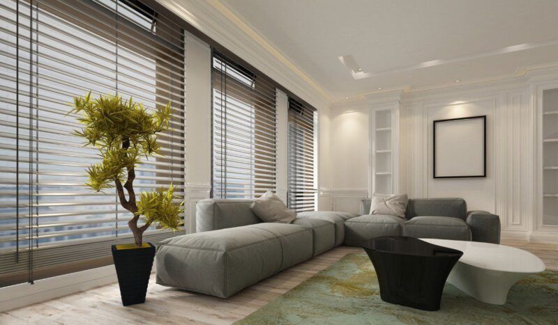
Popular Materials and Their Color Adaptability
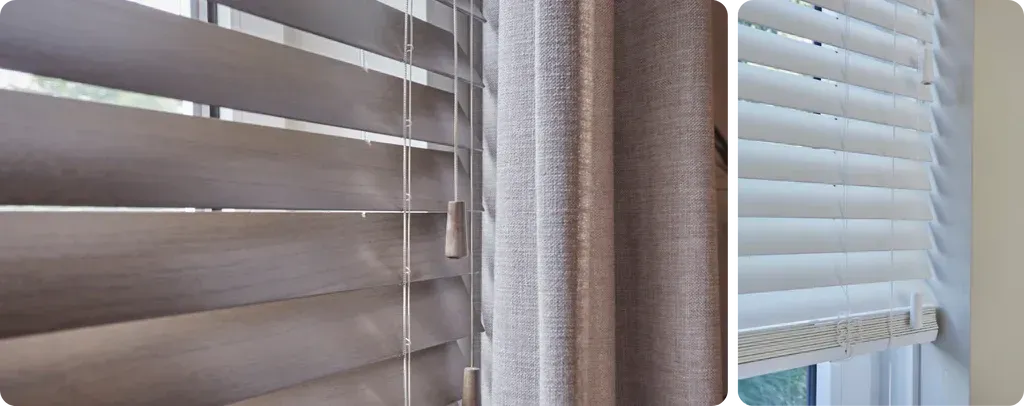
Color isn’t the only factor — materials influence how that color is perceived.
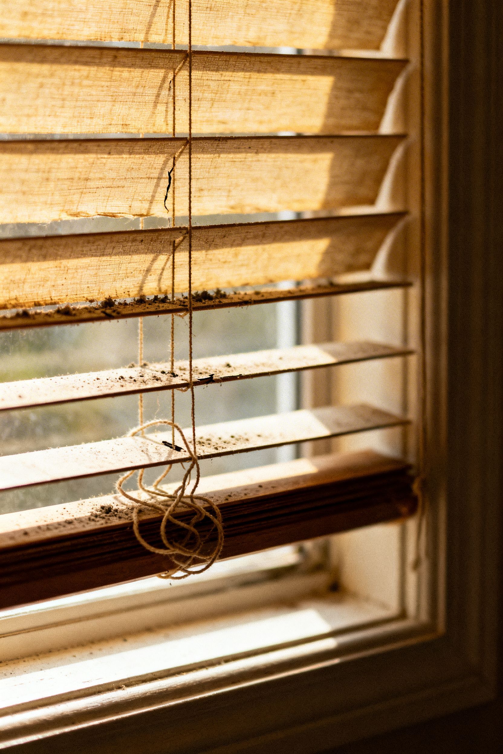
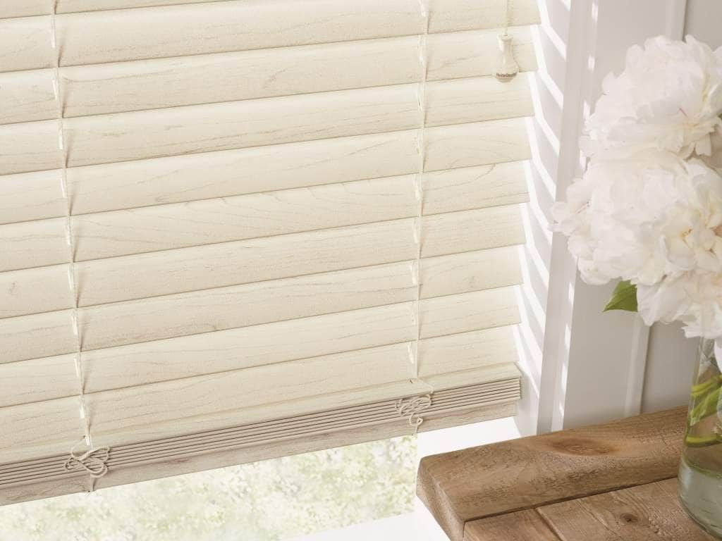
Wood Blinds
- Richer tones: espresso, walnut, oak
- Great for earthy or classic interiors
- Adds natural texture
Faux Wood
- Consistent coloring
- Moisture-resistant (great for kitchen/bath)
- Comes in white, gray, and beige finishes
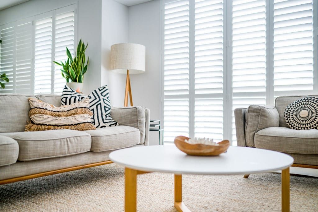
Aluminum
- Sleek metallics and bright whites
- Ultra-modern vibe
- Light and affordable
Fabric Blinds
- Layered tones and
subtle patterns
- Best for softening rooms
- Pairs well with curtains or drapes
Pro Insight: Fabric diffuses light differently — test swatches with sunlight before deciding.
Trending Yet Timeless Blind Colors (2024–2025)
Neutral doesn’t mean boring — today’s trending colors are sophisticated and subtle, especially as seen in evolving Vertical Blinds Style Trends for modern interiors.
Current Favorites
- Shiitake (Sherwin-Williams) – soft greige with warmth
- Simply White (Benjamin Moore) – clean and classic
- Pale Oak – barely-there beige
- Egret White – gentle off-white with a touch of gray
These shades offer:
- Flexibility for evolving trends
- Longevity across seasons
- Stylish minimalism for transitional homes
Common Questions About Blind Colors (FAQs)
Should all blinds in a house match?
No, but they should coordinate. For open floor plans, keep a consistent tone (e.g., all whites or all soft grays). In closed rooms, tailor the shade to the room’s style.
Do white blinds go with everything?
Yes. White blinds are the most versatile and timeless choice — perfect for every wall color, trim, and style.
What’s the safest blind color choice?
Light gray or off-white — they straddle both warm and cool undertones.
Can I mix blind colors in an open floor plan?
Yes — but proceed with care. Stick to one neutral palette to maintain cohesion. For example:
Living room: pale gray
Kitchen: crisp white
Dining area: ivory
Keep the finish and material consistent to tie it together.
Are darker blinds okay in small rooms?
They can be, but use with caution. Dark gray or espresso blinds add contrast and warmth, but can make small rooms feel tighter. Use them sparingly or as an accent.